Saturday, 13 July 2019

Mia - The Crafters Workshop - Guest DT July 19


Hi there Mixed Media Stencil Crafters.
I am so excited to be on the blog this month to show you my #tcwstencilLove. I have been experimenting with so many different styles of mixed media and I a can't live with just one. 
I cant call myself a designer, I rarely have a plan when I create When I create I let the mediums show me how to pull my designs together intuitively. I look at ways to really add some fun and take the techniques to class rather than the pattern.

 For you all I have shown you the process of how I transition a recycled canvas and between mediums and discover the bonus effect of layering before discovering a textured focal point. This process can be applied to almost any surface and will take many mediums a to create very different designs.

This one I'd created featuring stencils from the winter release '19 range from The Crafters Workshop.


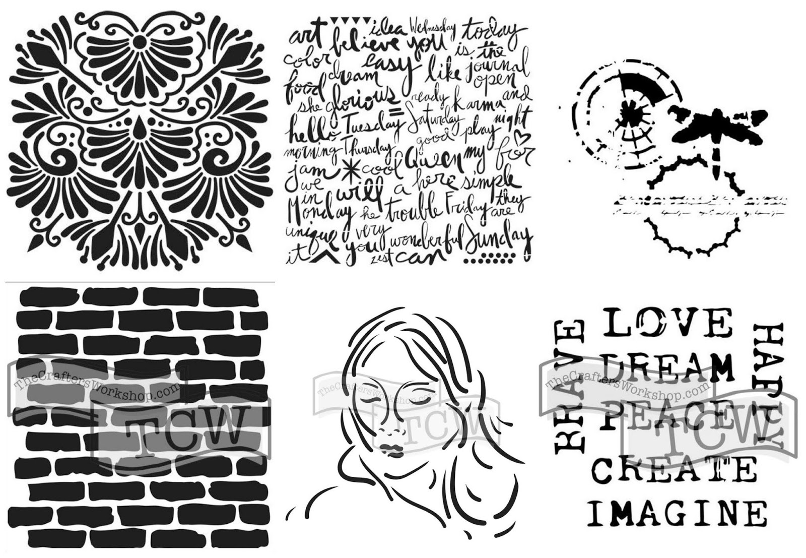
To kick off I grabbed a handful of bright acrylics and old book paper. I put blobs of paint on the canvas and spread it with my brayer. I placed over the canvas a 12 x 12 TCW191 Bricks Stencil and used a wipe to create a shadow. I stuck down random strips of book paper and covered the pages with acrylics and spread with the brayer again. I sponged Gesso through a 12 x 12 TCW858 Delicate Impressions Stencil from the Winter 2019 release. 
The dragonfly is GORGEOUS!
 I like the format of the 12x12 as it allows for focal points to be proportionate to the size of most off the page projects. I repeated the brayer and stencil process until I was satisfied.


 I believe my best mixed media projects come from my ability to let go of a background. The canvas would be great just the way it is, right? Maybe...
However I love the complexity you can get from doing just a bit more''. So here I go... I added a contrasting layer to push the first set of colours into the background and creating a base for the next layer. I used stencil TCW833 Fantastical in 6x6.


I added some crackle paste to the page hoping to get the really bright background to pop through... It didn't happen so I pushed it into the background with another stencil I found in the New Winter Release TCW832 Script Words.


In order to finish off the second layer I added one final layer with the brayer. I wasn't getting any paint into the cracks with the brayer and rubbed some in with my fingertip. I used a wipe to blend it and finished off with some stamping.


LOOK AT THOSE LAYERS
I dry brushed some black paint over the whole project... we found the cracks!!


I wasn't so keen on the black. It seemed too final.
Lime and Coral will fix that!! 
One last time brayer...


I was really happy with canvas it was only a background so I needed to build a focal point. Tissue paper is great. A little TCW Gel Medium Matte and it is semi-transparent.


Here is another favourite of mine... I can now add a little bit of bling to my chipboard in minutes. 
I used a foil and TCW Tacky-when-Dry Medium. Once it was dry I used a gel pen to outline the score marks in the chipboard. 


I needed to create my focal point . I really wanted to use the metallic pastes for this one; I was really keen to see how they contrast over the black layer. I used the stencil TCW697 Mia. I teamed that up with some chipboard aiming for flowing locks. 

In this image I blended several colours on mixing plate and loaded up the pallet knife with paste. I applied it diagonally over the stencil to create striations. I scraped the excess off onto the canvas intending to use it as a base for the hair.

I placed my chipboard into the paste using it as an adhesive. Using a paper towel I created some peaks in the hair. 
To finish off I used some TCW Black Modelling Paste on my finger and rubbed it onto the chipboard and dry brushed it over the peaks.


I loved this paste. It is thick and flexible and has amazing dimension. 
Its my new staple and here is why. 

I collaged some feminine elements into Mia's hair and created the title. Look at the  titles I created with the stencil. Absolutely love them and the possibilities...


Thanks for looking and if you are keen to see more of what I create then click on my image below. 

Insert Image


Monday, 24 June 2019

Altered Birthday Box - Dusty Attic June Inspiration

Hi All...

I have my inspiration post for you all to try out. This time round I altered a box. 
This one is super special as it will eventually be gifted. In the collage are secret pieces that relate to the recipient. 
I hope she likes it and I hope you do too. 
There's nothing better than making intimate gifts for loved ones, don't you agree?


This was tricky because I tried my hand at resin pouring and made my own embellishments from moulds.  The face, rose and leaves as well as the mechanical stars were all a part of this process.


I used waxes to colour this project. I wanted to leave as much of the colour as I could so I used beads and Prills to add some accents.  


I layered some paper on a box I held onto to alter. I have had this paper in my stash for ages so I thought it was time to play. I added a base and some torn corners and placed a little lace in between to add to soften the look. 


Using my Dusty Attic Stencil - Leaves #2 I added some texture to the front. 


I grabbed a selection of Dusty Attic Chipboard to use as my Matt for my collage. I gave them am light coat with gesso and selected some other embellishments to add colour. 


I chose to keep the colour simple, a naturally vintage inspiration. I used some beads and Prills to finish off the piece and highlight the peaks and troughs. 

Check out the close up below!


Here is a list of the Chippies I used and links to the site if you like the selection.


Abela Artistry


Sunday, 23 June 2019

Brotherly Love - Dusty Attic Mood Board Inspiration - June 2019


Hi there Attic Dwellers... Today I get to share with you my Mood board Inspiration for June! I took this picture of my boys last year in winter. We were out at Coogee Bay for lunch and took a stroll along the clifftops! Absolute perfection. 


Here are some close ups of the finished product so you know what techniques to look for in the post! 


I started out creating a base for my page... I like the wood paneling as it recreated the jetty. 


Using my tool of choice, the brayer, I added some custom colour to the background to better reflect the colour pallet. I added some vertical and horizontal lines to break up the splotches and frame the jetty.


I created some texture with a harlequin stencil and used some light and fluffy paste. I really like this paste as it leaves a raised dimension without needing to add a lot of paste to your page and avoiding stencil bleeds... Ew! I used some water based crayon to highlight the ridges. I rubbed it onto my finger and lightly brushed it along the stenciling.  


I highlighted the edges of the wood paneling with Distress ink directly from the cube. I love this look as you often get striations in the ink. 


I was handed a bottle of this to play with... So I did! I applied a generous coat to my chipboard and left it to dry naturally overnight. I used mica sprays to colour the chipboard and I didn't prime it first as I wanted the cardboard to soak up the colour and leave the shimmer on top.


How good does that look!!
I used glossy accents for the reeds. 
I wanted some variation in the texture. 


I have been eyeing these little beauties off for a while now and finally got my chance to showcase them! 
I dabbed them into white gesso and created peaks in the acrylic. I also added a little Fluid Acrylic to colour the wings on the seagull. 
When i was in Arizona for Creativation i was taught the technique i used on the posts. 
OK.. I'll share!
With this one you use a powdered watercolour pigment. I used a little Satin Glaze Matte for this but you can use any clear drying medium to create the effect. Sprinkle a little pigment onto the chipboard and wet your brush and swipe! Perfect woodgrain every time!!


To complete the page I added Splatters, Stones, Sisal and Beads. Thanks for stopping in to look at my latest creation. 

Please pop on over to our Dusty FANattics page on Facebook and show us what you have created!!
Ciao for Now...


Dusty Attic Products Used


Saturday, 25 May 2019

Dusty Attic Mood Board Inspiration - May 2019 - Your the One!


Hey Attic Dwellers! 
I have been busy playing with my Chippies and flourishes and have this gorgeous layout to share with you! I am am bit saddened that the weather has turned. No matter how hot it gets I still prefer it to winter... Brrr!! So check out this inspiration... I'm counting down the days 'til the spring blossoms are again in bloom. 


To start I had a play with my Modelling paste Black! OMG... In LOVE! 
Look at the way it perfectly framed all the chipboard in this layout. Here I marked out a boundary for my focal point and repeated the pattern in the stencil to frame the whole image.


I rarely use purple in my layouts and from what I read among other crafters' - you either love it or hate it! 
Its my favourite colour so perhaps that's why I am scared of it. The inner voice asking, "Will I do it justice?" You can decide!


I really felt that it needed a pop of colour so I tested it on the area under the focal point and BOOM! Look at that separation of colour! 


I used embossing powder to colour my Chipboard, I wanted the glossy look of sunlight reflecting off the flowers. I didn't have any dark flowers or embellishments so I ended up dying my fabric and flowers to match my layout. To give it a touch of femininity without colour i used my Dusty Pearl Flourish Bling... perfect!


Found these awesome paper straws! Check out your local IGA in Sydney or Melbourne... Perfect embellishment - (and a plug for hubby who distributes the product..)


I used some archival quality ink in blue and black to stamp in the background.


I finished it off with a Cuts 2 luv Flair... 
I hope you enjoyed my creative processes... 
Thanks for looking!!

Dusty Attic Products used. 


Thursday, 23 May 2019

RHHS Embrace the Journey - Dusty Attic May Inspiration

Welcome back to my blog... 
I did this project as a photo challenge....
 I loved every photo in this set and none of them were really stand outs! So I used them all to create a filmstrip of images to show how much fun we had the morning we sent Aksel off to High School!!


Using White gesso to partially prime my cardstock I applied Distress Spray to the surface I wanted the cardstock to both absorb and resist the colour. Using some chalk paint to darken the top and diluted it to create shadow in the gaps of the Chipboard. 


I love the look of this - Stone Washed Denim!! #childofthe80's


For texture I used Rust pastes to age the piece. 


I gently rubbed the oxide pads over Dusty Attic Corrugated Cardstock in our school colours (yes, poor boy... I went to the same school) and framed the images with a touch of white gesso in lieu of a matt.


I created a background of plasterers tape, Stamping and Stenciling to layer my chipboard onto. I used some metallic paint from and painted the wood veneers Blue and the Industrial Globes in yellow. 


Here is a close up with the prills and paint splatters.


These are the images from the opposite page.


Without making it too obvious... I worked the date into the embellishments!
Thanks for looking!


Dusty Attic Products used 


Other Products Used

Paper Artsy Chalk Acrylic - Pea Coat
Distress Spray - Denim
TCW Remnant stencil - Ancient Wheel
TCW texture paste- Grecian Gold
Darkroom Door Stamp - Crosshatch
Paper -Studio Light Industrial 3.0
Studio Light Grunge Stamp Collection #341
Tsukineko Archival pigment stamp pad - Blue
Prima Texture paste - Rust
Plasterers tape
Wooden Veneer letters
Tim Holtz Chipwords
Black, White & Clear gesso
Prills
Art Alchemy acrylic - Midnight Sky 
Glossy Accents
Prima Cabochons
Sisal