Sunday, 30 May 2021

Happy Anniversary & Happy Birthday - Dusty Attic Mood Board May 2021

Once a year we have a very special day to Celebrate... 

When I visited my now hubby's parents for the first time, Nine years ago, I noticed memorabilia on the wall referring to my birthday. I casually asked and discovered my in-laws were married on my birthday. Its been a big day of double celebration ever since... This was a few years back... 

However, this year they celebrate 50 years together... 
Congrats to them!


I used the background to help bring the page to life. In this collection there was also a sheet that had abstract cutout elements that I fussy cut. I used them to shadow the original page. I added some modelling paste and sprinkled embossing powder on it. Once dry I heated it and got a variegated look. 

 
Here are the elements I used to bring my page to life.


I have always loved matting... Modern pages have stopped using a quick easy way to draw the eye to a focal point so I thought I would play around with it on this months layouts. I added a squiggly frame to the photograph to help block out some of the background noise.


My favorite element was the title.I used chalk paint and paint pens to create a weathered looking title and used white pen to accent it. I love the way the white lines give dimension to the 2D embellishments. 
 

I used lots of layering and foam tape to recreate the effect of layered flower. Stars were for wishes and hearts for happiness.


Check in on the Dusty Attic Facebook page - Dusty Fanattics...a place to share and inspire... I look forward to seeing your creations!! Thanks for looking!!


 Products used

Stars #4 

Squiggly Frames #6 

Today's Memories - TITLE

 Industrial Star -2

Swirl #1 

Swirl #2 

Friday, 16 April 2021

I am enough - Dusty Attic Inspiration for April 2021


 Hi Dusty Fanattic's

With the changing of the season and a new job... that is super hectic, and a little out of control, I created a post that reflected the changes around me and a little reminder for myself that I am enough. I hope you like the mini tutorial and find something new for creating backgrounds for off the page!


Here are some close ups of my project.

  
I started with some paper piecing. I always have a stash nearby that I use for my journal. I wanteTo create a white washed look I covered the whole piece in chalk paint.d to add some texture in the background so I distressed the edges of the cardstock, cut them into squares, added some plasterers tape and old die cuts. I covered teh whole thing in a layer of gel medium to help with the resist on teh distressed edges of card.


To create a whitewashed look I covered the whole thing in chalk paint. One it was touch dry  I used a baby wipe to rub back the areas I wanted the rusty paper to peek through. This helps all the elements look like they belong together.
 
 
I did the same thing with some orange paint and then dry brushed some red on there. The dry brushing ends up sticking to the areas that are raised so it is a great way to add some highlights. 
 

It was time to decorate my chippies. 

I used a base coat of brown on the chains and then added some rust paste by dabbing randomly with my brush. The best fix for a heavy hand of rust paste is to just go back over it with the base coat and play until you get a realistic look. I touched some yellow paint to the top of the chains to finish it off. 

I wanted to grunge up the cogs as my contrast colour. I used a base of blue, a layer of dark green and then a dry brush of burgundy... and a dry brush of creamy white. I really just kept adding layers until I got to the point where i was happy. If it didn't work... I would have just painted over it and started again. It doesn't hurt to just play...

 
I have always found it difficult to display tags once created. I love the way they are mini masterpieces and don't take up much room but they often fall off the wall or get knocked over. My crafty partner in crime (Kerensa) has designed these stands for me! If you love them too you can email me and I will put you in touch with her and she can send you out some! For a small fee of course...


Thanks for looking and I will keep my eye out on the Dusty Fanattics page to see your fantastic creations. Till next time... Kristy!


Abela Artistry

 Dusty Attic Chipboard used...


Monday, 5 April 2021

Every photo tells a story - Dusty Attic Mood Board inspiration - April 2021

 Hi Crafters!

I really enjoyed the Mood Board this month. I found some amazing masculine themed paper in the new releases from 13@rts. There is a more laid back set and this one here is aimed at teenagers. Its not often we get young male inspiration and this new release is page after page of great ideas. I loved the composition on this piece and really let the paper speak for itself. All it needed was some dimensional accents from our favourite Dusty Attic chipboard and some clever composition. Instead of talking about how I decorated the chipboard I thought I would give you some tips and hints on composition. Let me know on our Facebook page if they help!


 I treated myself to something new from the Tim Holtz release and found this tissue paper. Perfect for my puzzle pieces! I used Gel Medium to stick it down and used a light spritz of water to peel off the excess once the underneath layer of Gel medium was dry. Then I added another layer to seal it. Either gloss or matt gel will do the job. If you don't have any Tissue paper you can always paint the chipboard pieces white and use your favourite stamps to get a similar effect!


I really wanted to highlight the circle in the background and use it as the frame for my composition. You will notice that I haven't added any dimensional accents on the left hand side so the eye is really drawn to the collage within the circle. To enhance it I used some regular old string, brushed some water based black dye, and a few staples... Nothing says teen grunge like dirty water and bits of metal!

I matted the background with black Bazzil to frame the composition and I used my finger to run some black paint around the edge of the photo. This created two black square-ish shapes on the page. Repetition of shapes helps create cohesion and also framed the photo in amongst all the bright colours to draw the eye to what was important.

 
To give the chipboard some place to 'sit' I created a neutral texture in the background with my favourite accessory, Plasterers tape!! I love this stuff because you can cut it at different angles to create some amazing shapes. It also helps to give your mediums something to stick to. Can you see the the gold leaf flakes? How cool are these and they give a touch of an electroplated influence to a page. Can you see how the mesh tape in the background gives it a place to rest? I applied the tacky glue with a pallet knife and because of the ridges you can get a really random effect when you brush off the excess.
 
 
 I wanted to colour the chipboard to tie in with the background palette. Because it is so bright, adding more colours would confuse the focal point. In this composition we have used black and white as part of our palette. When creating with bright colours we need to 'calm the page down' at some point otherwise our eyes get overwhelmed. Without black and white to do this, grey becomes a great option as a neutral! To break up the layers of chipboard I added some interest by dabbing texture paste on the Broken Bits - Bricks with a brush. I added some variation of colour with chalk paints. If you don't have texture paste you can add some sand to acrylic paint and get the same effect. 


 A plain white title on top of all the crazy was all I needed to finish it off. See how I used the Grey again to frame what was important on the page? 

I hope that you gained some clever tips to help with your next project.


Products used

Broken Bits #9

Jigsaw pieces - Medium

Perforated mesh

Title - Every photo tells a story

Triangle Panel - Small

Mini Brackets


Tuesday, 23 March 2021

Altered Couture - Handmade Journal - March inspiration post

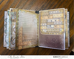
 Well... A little journey into some serious YouTube distraction got me inspired to create this handmade mini album. I had some Chipboard sheets and thought that this would be a perfect use to create something totally customised... and use up what was left of an old paper pad. 

 
To create the cover I used clear crackle and a little bit of Walnut stain on the cracks to give it the weathered look. Once dry I rubbed a distress crayon over the top. This was picked up on the highest cracks and ridges and left just a touch of colour and I blended it with my fingertip. I covered the clock in metallic paint and the rest of my chipboard with chalk paint. Once painted I used a little bit of wax to highlight the edges of the frame. 
Check out the little dragonfly! Gel pen...


I used the chipboard filler to support the frame here. The title was a smidge too big! By not overloading the paint and using a sponge to dab it on I was able to save the detailed line work. 
Check out the Gel pen!! Can you tell I have found a new fav?! 

Wondering what the Title means? It's the theme of the paper and both my Grans were seamstress. I am planning to add the vintage black and whites I have of them to the album. Dusty attic have a HUGE range of Mini Chipboards. When I get around to filling the album I will add them as accents to the page. 
Check out the album walk through below. 


The pages are created as sleeves so there is this cool little opening that you can add an insert into. I really enjoyed creating these pages and the extra wide signatures mean you can pack a lot of stuff in the pages without worrying about how they close.
 
 
The back cover has the other half of the Fancy trim #22. The album is quite wide and it gives your fingers something to grip to when holding it and flipping through. 
 
 
Thanks for looking and if you have any questions reach out on Facebook or Instagram!!
 

Products used

Chipboard sheets

Mini Dragonflies

Frame Medley

Fancy Trim #22

Lace Border #2 Small

Decorative Frame #4 Small

Mini words #3 - Artist

Skeleton Clock Face


Cherish the day - an Industrial Mixed Media Canvas

Hello Dusty FanAttics! 

I have been itching to do a canvas for a while now. So I stopped procrastinating and just did it!! This Industrial style layout features a whole bunch of colour layering using fabric, lace, metals, cabochons and flowers PLUS our Dusty Attic Chipboard to bring it to life! I'm planning on doing this in an upcoming class if you want to have a go at trying it for yourself. This style is super easy with the right background and Dusty Chippy is the perfect platform to build your own masterpiece! 

 
Here are some close ups of the finished piece! 


Here are the Dusty pieces I used to make this layout. If you are interested in learning how to do this style of Mixed media head over to my Facebook or Instagram on the links below and let me know!


Industrial Gears Large

Wings #3 

Skeleton Clocks Faces Large

Mini Titles #1 

Roman Numerals 

Abela Artistry


Monday, 22 February 2021

Moodboard Inspiration for February 2021


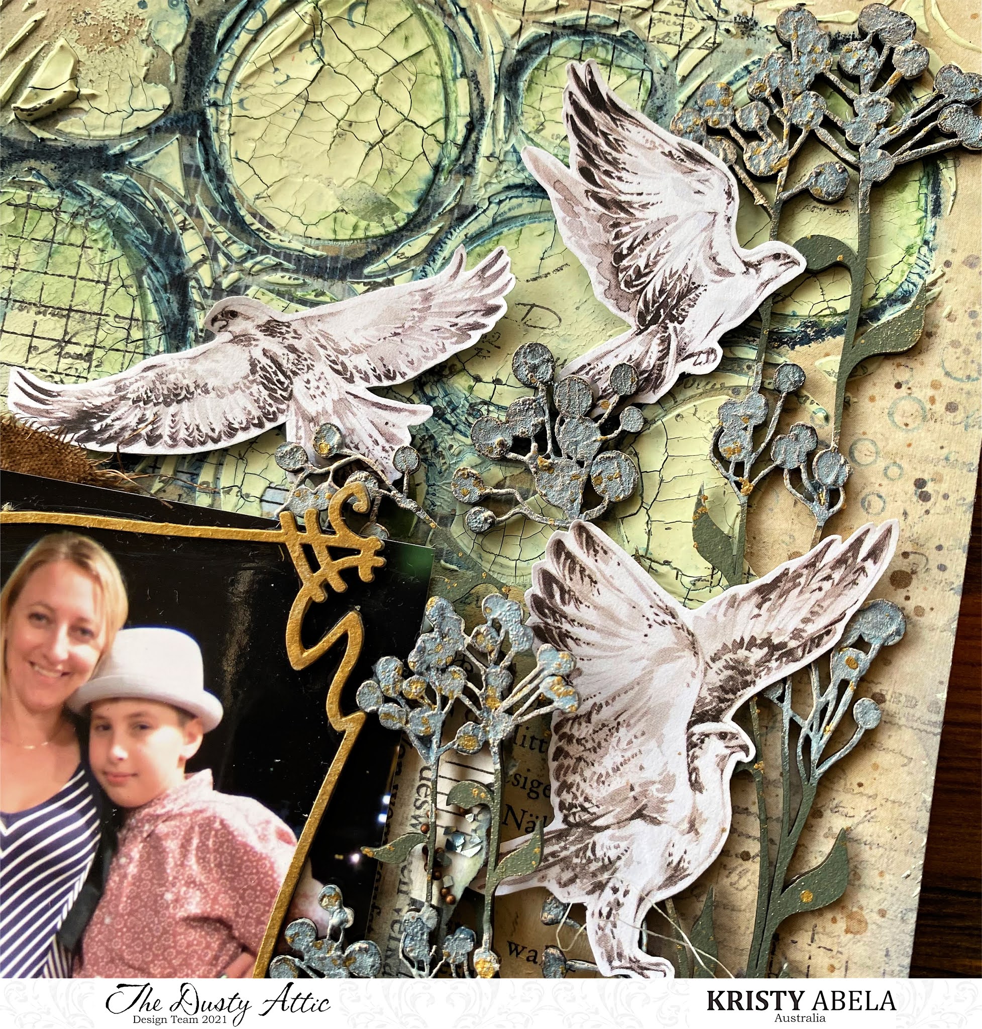
Welcome to February!!! The gorgeous pair I am posing with were attending the Year 6 Farewell. Aksel's now in year 12 and Ruby has grown into a lovely young woman and has left school. I had so much fun shopping with Ruby for her dress, her first Big Girl Dress. Yet all Aksel wanted to wear was boots!! Isn't it funny how these moments only seem like yesterday. For all of us, slightly different memories. Nevertheless... DOCUMENTED. 


Anyhoo... here is a rundown on my creative process.. I started my background with some book pages and scrapbook collage papers I have on my desk. I used some clear gesso to seal them and then added some highlights with some Neo Colour crayons in a similar colour. While the gesso is still wet it blends the pigment nicely and allows it to move around the page. I then added texture paste that I tinted with some chalk paint.

 Once dry I used some blue and green Neo Colour to add some contrast to the scribble circles in the stencil. I added a spritz of water to the crayon and it welled up and filled in the troughs.  

I kept the frames simple and used some golds acrylic paint to draw attention to the images.   


To decorate the wildflowers I used a chunky layer of gesso ensuring that the peaks and ridges were well defined. I used my Lindy's sprays and applied directly from the dropper onto the buds. I used two layers to get the colour intensity I liked. Once it was dry I used some gold wax and applied it lightly from my fingertip.


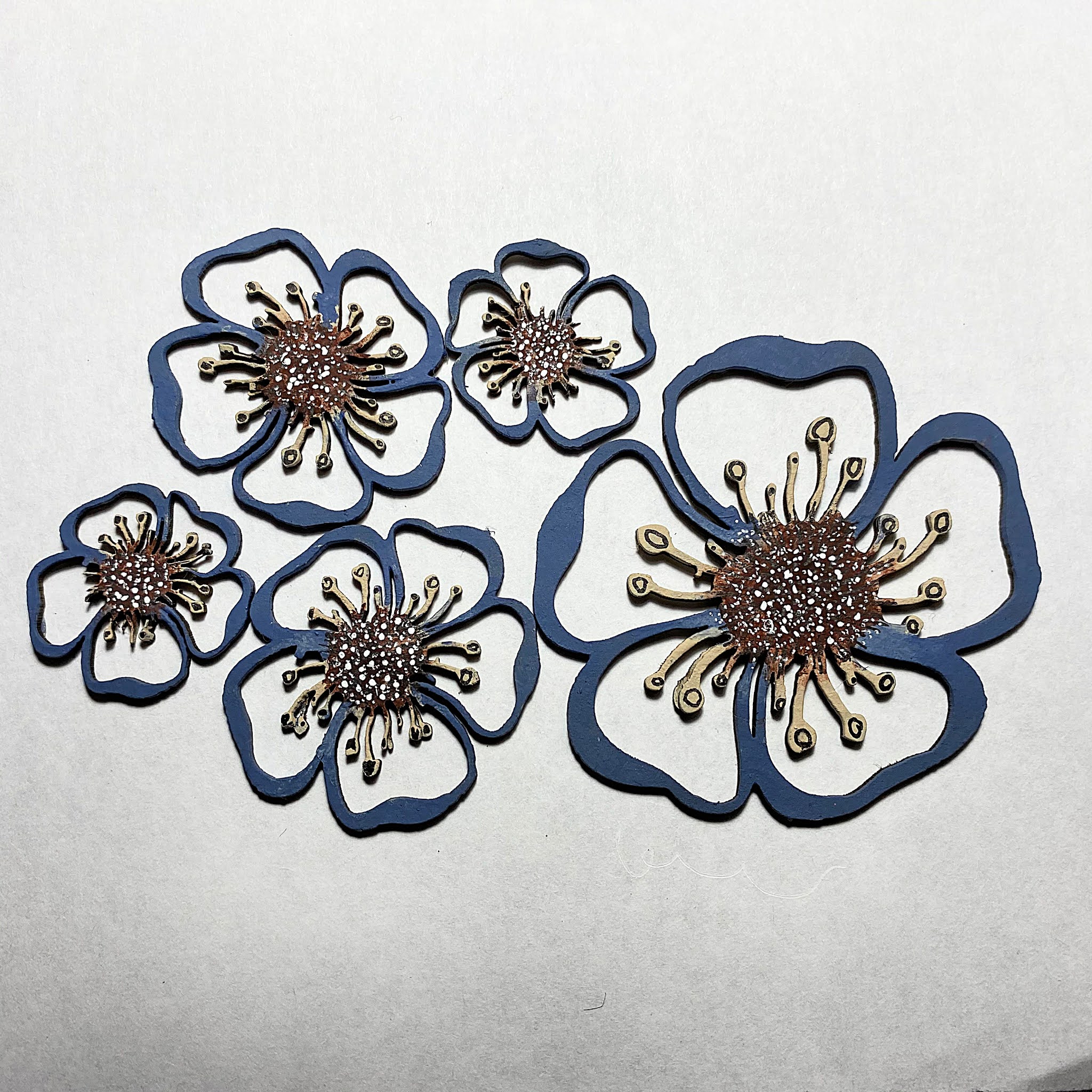
I used chalk paint to colour the flowers. to create the stamens I used a gel pen to add definition. later in the project I added a cabochon to the center. It magnifies the detail and makes it a cool 3D look.
 

I had fun digging deep and finding some memories. I hope you enjoy them too... 
 
Abela Artistry

 Products Used

Wildflower #3

Blooms #1

Wild grass #3 Small 

Squiggly Frame #3 

Squiggly frame #2 

Mini Seagulls

Mini Captions #18

Circle Stencil DA1608